MC Ticket
our ideas
Visual Hierarchy in Graphic Design – Marketing Edition
18/08/2020
Ryan Doom
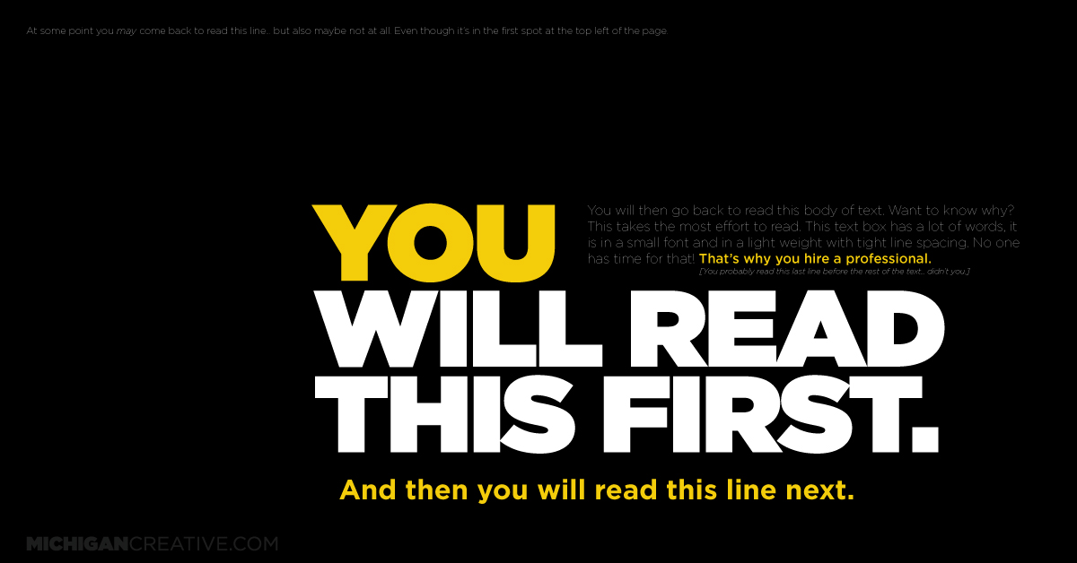
Simply put, visual hierarchy is the arranging of elements within a composition to show a level of importance in the design. A designer will utilize various principles to guide the viewer on what to experience first, next, and last. Color, contrast, orientation, positioning, size and shape are all tools designers use to establish an organized cadence to a composition. When receiving information in a prioritized order, it ensures the message is clear and easy to digest.
We have, maybe, three seconds to grab a viewer’s attention and keep it. That is some serious pressure! Here we will dive into some of the basics of visual hierarchy in graphic design and how it plays into marketing.
Simplicity is king.
The goal is to accurately and successfully convey the information in a short amount of time so it can be understood. So keep it simple! Too much information leads to an immediate loss of interest. The popular saying is “less is more”. This saying absolutely applies when considering content for a marketing piece. It’s best to put out short-and-sweet, bold statements and uncomplicated graphics that direct someone to the main idea of your message immediately.
Keep text short and sweet.
People are more likely to purchase a product, hire a service, and read a billboard when it’s simple to read, easy to navigate, and quick to understand. Get straight to the point and keep text to a minimum. Leave the long paragraphed, content-saturated text layouts to the booklets, newsletters, websites, and annual reports. In a marketing piece, you want to point the viewer to learn more by including a link to a website or an online source.
Establish a focal point.
The very first thing you want the viewer to read should be your focal point. Color, contrast, orientation, positioning, size and shape are all tools to help establish a focal point and give the viewer a clear place to start. You’re essentially choosing a bold statement piece and then placing it like a large “ENTER HERE” sign. The absolute distinction between the focal point and all other aspects of the design, help the viewer along the way on their consumption journey throughout the maze of your composition.
Map out content hierarchy.
After establishing your bold statement or attention-grabbing piece, select which text needs to be read next, and so on. Organized and structured design elements make the user experience refreshingly easy. Typically, people read from top to bottom and left to right, but that doesn’t mean the information you’d like people to view first needs to be located at the top of the layout or on the left. As a rule, much larger text is typically read first no matter where it’s located. Bodies of smaller text are usually read last, if at all. Only the information at the head-of-the-hierarchy-line is successful in enticing the viewer to continue reading.
Size matters.
Elements that take up a large area in a layout tend to get noticed first. However, things that are too large may be overlooked and only recognized as background noise. Comfortable font sizing and uncomplicated graphics make content much easier to digest. Signaling a clear starting point by bolding the first line in a body of text will entice the viewer to continue reading. You can also use different sized images, illustrations, symbols, and shapes to create a successful visual hierarchy marketing piece.
Create contrast.
Does your message blend into the background, or does it attract attention? I like to tell my designers to “pump up the volume” to give the viewer a clear direction through contrast. Think strategically about sizing and colors to avoid confusing your audience on what to read and when. Choosing the best sizes and colors for design elements within your composition means putting some thought to what works well to draw you in, and what combinations work well to move the viewer through your piece in the correct order.
Embrace space.
White space or negative space refers to the blank spacing around a specific element. This can be text, an image, or an illustration. Negative space basically separates design elements while also helping to establish a successful hierarchy and organization of information. This wide-open area can be any color and is equally as important to a successful composition as the main message of the piece. Ample spacing allows the design to breathe and helps guide the viewer throughout the composition. A large area of space can also serve as the magnet that pulls the viewer to a tiny bit of important text.
Alignment is awesome.
With tons of information to place within a single composition, the design can quickly become overwhelming and very challenging. The plan is to create a successful visual hierarchy plan of attack. By utilizing text alignment, the viewer can access the information on the page. Aligning important information for required reading with images or objects that literally point to the text can be helpful. Using a grid-based approach to composition and layouts helps to maintain a sense of organization throughout and helps maintain viewer attention.
Visual hierarchy in graphic design is a simple concept but can be extremely challenging to accomplish successfully in a marketing campaign. Understanding the theory is actually much easier than having the ability to execute a well-structured composition. In whatever you are designing, make sure your marketing message is not only perceived well, but the audience is consuming it in the right order.