MC Ticket
our ideas
A Brief Lesson In Typefaces

We use typefaces on a daily basis, whether we think about it or not. We apply them in print, online, and throughout the entire multimedia spectrum. Sometimes these typefaces are not the stars of the show, but rather just something we picked out that goes along with the design because it’s easy to read.
Why not make them the stars? Everyone will be reading the words that you’ve written, so why not make the typefaces they’re written in a focal point of what you’re creating? If you want to start putting more emphasis on typefaces, it’s best to first learn more about them.
Let’s start with the basics.
1. “Font” vs. “Typeface”
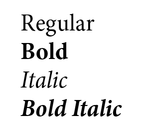
A lot of times, the word “font” is used when what we really mean is “typeface”. The typeface is the name of a certain text style. For example, Minion, Times New Roman, and Helvetica are different typefaces. They become different fonts depending on how the typeface is used, for example fonts can be bold, italic, bold italic, regular, etc.
2. Serif vs. Sans Serif
Serif (Dutch for “line”) typefaces have those little lines on the top and bottom. Examples include Garamond, Carlson, and Baskerville. A sans serif typeface (“sans” translated from French means “without”) does not have those lines. Examples of sans serif typefaces include Minion and Helvetica.
So how do we use these typefaces, and how do we change the fonts they take on?
Which Kind Of Typeface Should I Use?
When in doubt, combine a serif and a sans serif. One thing I’ve learned is to use sans serif in titles, and serif in the main body text. Serif typefaces work best for body text because they are easier to read in smaller sizes than sans serif.
You don’t always have to use a sans serif and a serif together, though; sometimes you might just feel like throwing a script style typeface in the mix! Scripts can be tricky; you want a script to be easy to read and enhance your project, while not looking out of place.
Or maybe you just want to use one typeface… Go for it! Sometimes using the same typeface for both a title and the body just works. If you go this route, maybe try a bold font the title, and a regular font for the body text.
Have fun looking around for different typeface and font combinations! That being said, don’t make the rookie mistake of having too many different typefaces and/or fonts everywhere. We’ve all seen it: 10 different typefaces and five different fonts, leaving you disoriented and confused, thinking, “There’s too much going on here! Where do I look?” Your design will look much cleaner if you don’t have more than two to three variations per page.
There is a lot more information about typefaces and fonts available out there, but I hope these basics are enough to get you started!
If you could use some general help with your design, we can help! Fill out the form below and we’ll get in touch.
– Siobhan Findlay