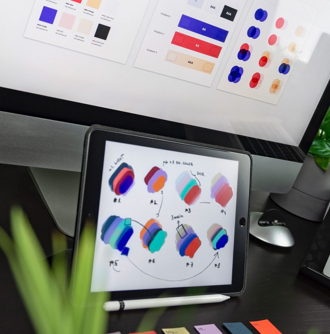
Your logo is the face of your business. Your logo defines who or what your business is at a glance. It has the power to excel your business to new heights. A logo should be memorable and instill confidence in your brand. It essentially explains who you are to your potential customers. Some factors to consider when creating your company logo are color, font, and shapes. They all influence potential customers and impact purchasing decisions.
Because your logo acts as a direct representation of your brand and is something that should last a lifetime (and then some!), it should have a professional and mature design because that is the first impression people will see when they look at your business. It’s pretty safe to say that your logo should utilize colors that represent the personality of your brand. A recent study by the University of Loyola showed that color increases brand recognition by up to 80 percent . Color can also prompt an emotional trigger while also persuading a buyer’s decision to purchase. It has a deep and often subconscious effect on our behaviors.
Here are just a few examples of the emotions that colors tend to spark:
Red is associated with passion and energy.
Blue often creates calmness, honesty, and stability.
Yellow expresses warmth and happiness.
Green usually represents nature and often a calming emotion.
Purple evokes creativity, mystery, wealth, and wisdom.
Orange represents enthusiasm, creativity, happiness, and encouragement.
More important than the actual color itself is the way your audience will react to it. When your logo is expanded or shrunk, does it still convey the same message or is it skewed based on size and readability? This is why you need to keep in mind whether or not your logo is versatile. When using intricate lines and details because those can easily get lost when you shrink the logo down. Also, some fonts aren’t as legible when scaled down in size and sometimes can show up blurred if there’s too much text within the logo. Keep it simple and get your message across. Make sure it represents your company and don’t overcomplicate it.
But, whatever design, colors, and font you choose, remember to always design your logo with your customers in mind. Consider your demographics and what message you want to convey about your business. Choose your design very carefully. Communicate your brand authentically. Use colors that spark a positive emotion. It all aids in your branding efforts and helps propel your business forward. It’s the job of your logo to show your value and message, it’s your job to ensure it’s conveying the right one.

