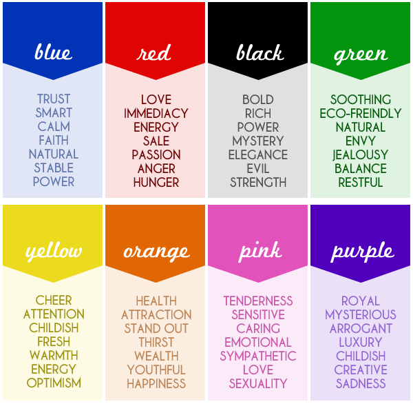
The use of color in design and marketing is extremely important, but does it have a deeper meaning? There has not been very much research done on this topic, although many people think that different colors can have different effects on moods, emotions and feelings. A good example of this is the fact that many social media outlets use blue as a main color in their logos. Blue is known to be a calming, relaxing color, also representing communication.
For the most part, your reactions and feelings to colors are rooted in your own personal experiences. That being said, not everybody is going to perceive colors in the same way. So, keeping all of this in mind, what are the best practices when it comes to using color in design and marketing?
Color is a visual cue for your audience. You shouldn’t use color as the main selling point, but rather as a complement to an idea that you are already projecting. When creating a logo for your brand, you should already have an established brand identity and personality.
For example, Apple’s brand identity is clean, professional, reliable and easy to recognize. They have portrayed those ideas since they first started. Now, take a look at their products; they are also clean, professional, reliable, and easy to use. Then, take a look at the colors that they use in both their branding and their products. Silver, white, black, gray; these are all very neutral, balanced colors. They are not too exciting or in your face, and they give you the visual cue that both the company and their products are clean and professional. So, do you see how they use those colors in order to portray the brand personality they are going for?
Another great example, also from Apple, is when they released the iPhone 5C. The ‘C’ in ‘5C’ stands for color; Apple wanted to do something to appeal to a different audience than the company normally went for in the past. While still sticking to their identity of those reliable and easy to recognize products, they decided to use color as a way to get to that new audience. Much different than their normal silver, gray and white iPhones, they released five different colored versions of the iPhone 5C, including pink, blue, and green… and people loved it. Some people are just more attracted to exciting, bold colors as opposed to the normal neutral ones!
Because of the effects that certain colors have on certain people, Apple was able to use it to sell essentially the same product to a new audience. The takeaway from this is that Apple already had established what they wanted their audience to think about their product, then they used color as a way to visually portray or confirm those ideas.
Creating your brand personality is number one on the list because you want people to think positive things by just hearing your brand’s name, without having to see anything, but, once you have achieved that, you can then use colors to complement those ideas and feelings to extend your brand visually.
If you are seeking help in using color to portray your brand visually, Michigan Creative can help! Click HERE to visit our design page and see what we have to offer, or contact us using the form below!
– Brandon Girard
Sources: http://www.bluleadz.com/blog/bid/94213/Why-Are-Social-Media-Sites-Blue, http://jasonathen.com/color-meanings-in-business/